


 Tweet
Tweet
Alright I'm back with the stuff that I had promised.
As many of you may know from xbhp suggestion thread that I had started working on a new theme. It took about hundred hours of work, sweat and spits to finalized the work(And now I'm blessed with insomnia ). This new theme of mine, I've named it Brushed titanium fan made theme for xbhp. When I started, there was no real inspiration or any goal I had in front of me. As with many people I always wanted to have ability to view the forum in full width. I went to do that. And if I had stayed with that one change my work would have finished in an hour. But when I started working, one thing lead to another and as it happens I ended up correcting many bugs which were left from old theme. While doing so I also added several aesthetics feature which I thought looked like they are at home. I have added depth to most forum elements. The big plus point of this theme is, it works above the stock theme, so you will feel like you're still on the same planet.
Brushed Titanium theme
Current release version 1.1b on 28-feb-2014
How to install Brushed Titanium theme.
In order to use this theme, you need at least one of the - Google Chrome, Mozilla Firefox or Opera - desktop browsers. Android, iOS, BB etc versions are not supported. If you only have Internet explorer or safari, you can use it download chrome, firefox or opera first.
installing the theme is very easy and it takes less than a minute.
For Google Chrome
For Opera
For Mozilla Firefox
Note: don't copy paste with ->
If for some reason it doesn't work for you let me know in the forum.
Quick Gallery
(To view pictures in full resolution middle click on them)
Note: you'll notice stuff looks very small in some pics. That's because screenshots are captured on my Full HD Monitor. I've included some samples from my small monitor too.
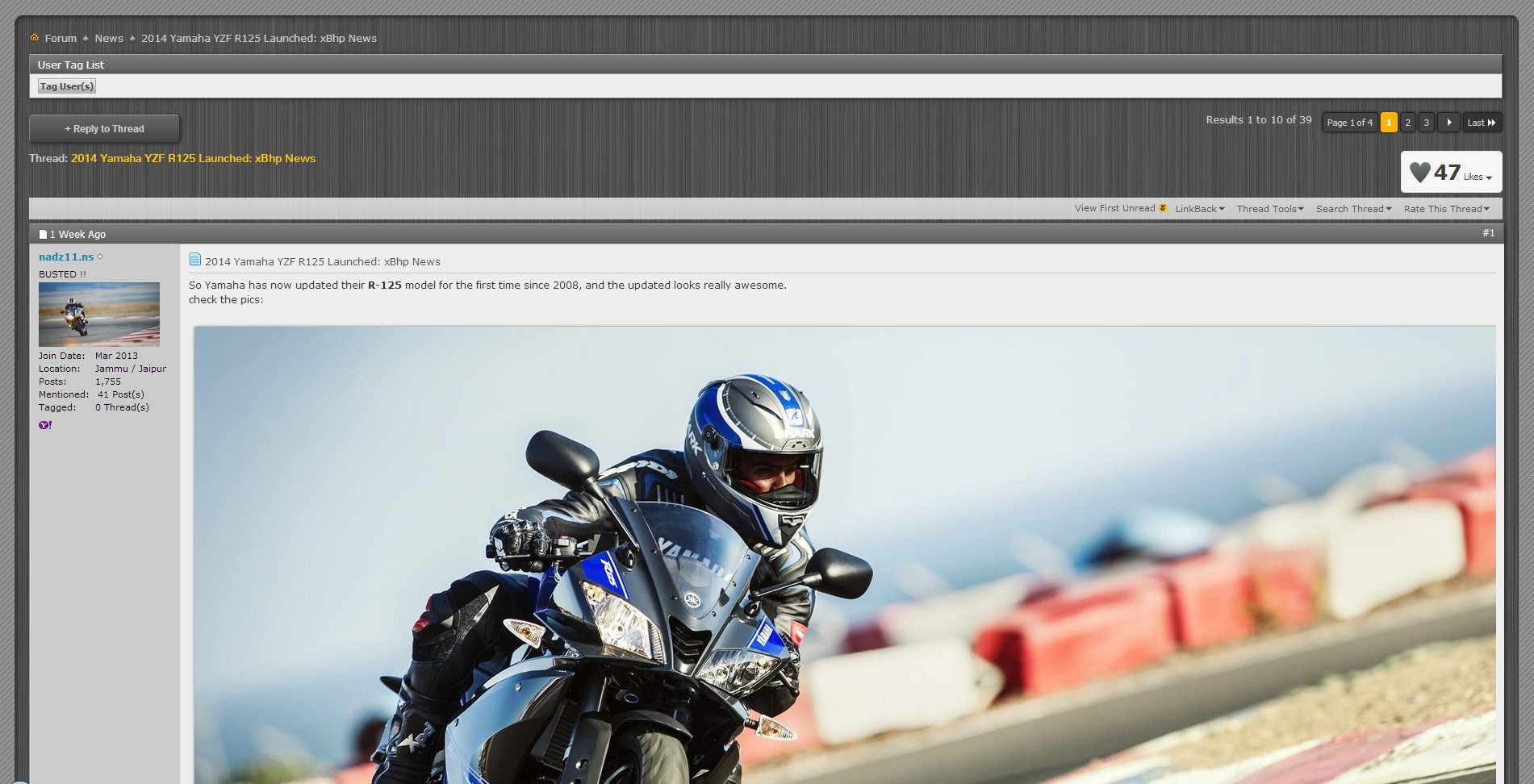
1. A thread list view.

2. Discussion view. (note the image has opened in full glory)
3. Discussion view on small monitor.

4. Contemporary looking forum bar

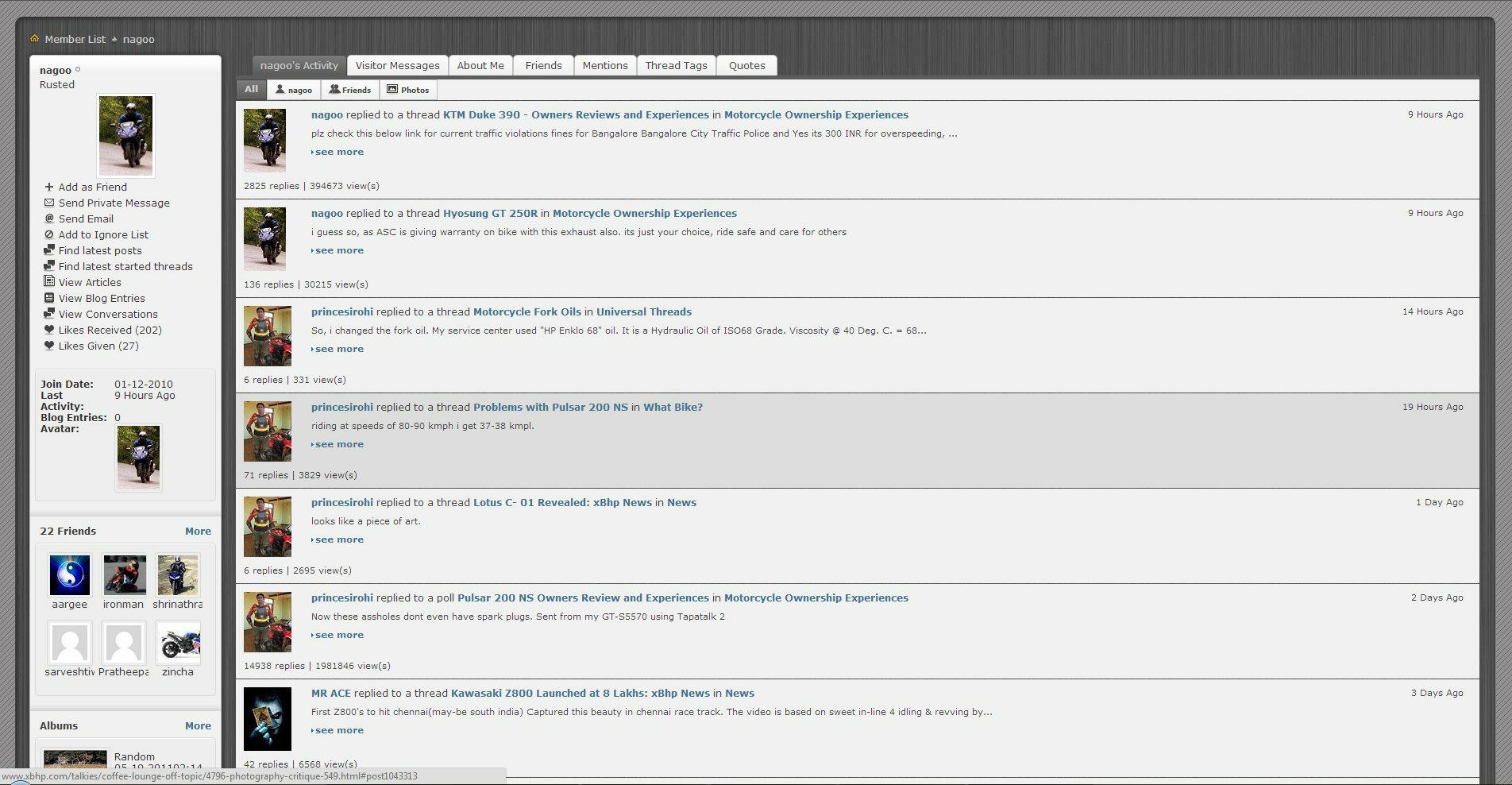
5. Profile-my activity (note my mouse is highlighting one of the row)
6. Profile-about me

7. Profile-Blog

8. Blog view

9. Pagination (Note the pages that I haven't visited are dark colored such as page no 88, 488, 538)

10. Reply button

11. Poll

12. Post Footer (Note images look elivated, Grooved like bar, weighted post footer)

13. Pm window

14. Last but not least the Inbox view (note how stuff has been arranged in multilayer way)

15. v1.1 >Corrected thread view for mods. (Notice how selected sticky and non sticky thread colored differently, also notice one moved thread is half opaque)

--------
What's New
Version 1.1 Released Mar14th, 2014.
Version 1.1 in now out of beta. Project is into 1800 lines. This is a moderator friendly release.
Feature list:
Histroy
FAQs
No documentation is complete without FAQs. Everyone has some questions, I'm answering most probable.
1. What parts of xbhp use this theme?
Only xbhp forum uses this theme or anything that comes under xbhp.com/talkies. Home pages, ads, classifieds, reviews are not touched.
2. What devices do/don't support this theme?
This theme runs on 'Stylish', so limitation of stylish applies here. It works for browsers Google Chrome, Firefox and Opera on desktop operating systems such as windows, linux and Mac OS. So all of the Computers, laptops, macs are covered.
Phones, tablets running iOS, android, windows, BB etc are not supported. Some MS surface tablets running desktop processors are supported though. Phones and tablets are unlikely to get supported in future so don't look forward for that. Pull your long faces.
3. What exactly is Stylish?
Stylish is plugin made for Google Chrome, Mozilla firefox and Opera. Almost a million downloads have been counted. It lets users pull different skins or themes for websites. There are literally millions of themes made for thousands of mostly popular website such as facebook, google etc. This theme I made for xbhp is first and only theme for the website. To know more on Stylish, Google please.
4. Does it affect servers?
No, It simply can't affect servers running website as the theme is running inside end user browsers. It doesn't concern servers in any way.
5. Does it affect the way website behaves?
No, The theme is applied through the means of CSS (Cascading style sheets) only. CSS are responsible for the stuff like colors, font size etc. The behavior of the website, on the other hand, is controlled by PHP (@ server side) and Javascripts (@ user side) which can't be changed unless I own the server. So in simple words, when you press a button, even though it looks different, feels different, it still carry out same work as it always does.
6. Is it open source?
Yes, as it's nothing but css coding so it's completely open source. You can view the source if you know how.
7. For whom the theme is applicable? If I'm using this theme Will my content look different on devices which are not using theme?
The theme is for only those who wanted to use it. It doesn't matter if you're member, guest, admin etc. you can use this theme.
Your posted content will look the same, no matter the theme is applied or not. Remember it doesn't affect how xbhp behaves.
8. How can I revert back to stock look of the xbhp? Can I disable/enable the theme whenever I want to?
You certainly can, it's super easy and takes only couple of seconds. All you have to do is click on the Stylish icon in your browser and click disable/enable. (for firefox it's 'disable/enable all themes').
9. How are the copyrights managed?
I have created this theme from scratch so it doesn't reuse any kind of code or image. This theme is however copyrighted to me and if you want to reuse this code commercially, you'll need my permission.
10. Can I suggest a new feature/change etc? Can I point out glitches?
That's why we have the forum for. Fire away your suggestion. Don't be shy. I'd really love to incorporate those in newer versions. I'm open to all kinds of suggestions. If you want me to work on classifieds, gallery etc parts of xbhp I think I could.
11. When new version comes out how can I update?
It's automatic. You don't have to do anything. updates are applied on the fly for everyone. There's no opt-out though.
12. Who are you? How can I trust?
I'm a hobbyist web designer with no formal education of this field. Many people and companies have sought and still seek my expertise. But it's not my profession so to speak. I'm an enthu just like you guys cheers.
---------
Lol it took me whole day to write this stuff down. Wrote through the night as well and now I can see dawn of the next day. Hardest part is over. Phew.
If you use this theme do let me know in the forum that you're using it. That way I can keep track of the users who are using it.
Any feedback is appreciated.
As many of you may know from xbhp suggestion thread that I had started working on a new theme. It took about hundred hours of work, sweat and spits to finalized the work(And now I'm blessed with insomnia
). This new theme of mine, I've named it Brushed titanium fan made theme for xbhp. When I started, there was no real inspiration or any goal I had in front of me. As with many people I always wanted to have ability to view the forum in full width. I went to do that. And if I had stayed with that one change my work would have finished in an hour. But when I started working, one thing lead to another and as it happens I ended up correcting many bugs which were left from old theme. While doing so I also added several aesthetics feature which I thought looked like they are at home. I have added depth to most forum elements. The big plus point of this theme is, it works above the stock theme, so you will feel like you're still on the same planet. Brushed Titanium theme
Current release version 1.1b on 28-feb-2014
How to install Brushed Titanium theme.
In order to use this theme, you need at least one of the - Google Chrome, Mozilla Firefox or Opera - desktop browsers. Android, iOS, BB etc versions are not supported. If you only have Internet explorer or safari, you can use it download chrome, firefox or opera first.
installing the theme is very easy and it takes less than a minute.
For Google Chrome
Step 1: Open chrome and Add Stylish plugin for chrome > here . Click on "+Free" button to install. It'll ask for permissions say add.
Step 2: You'll notice new stylish icon (With big 'S') on the top right side of the browser. Click on it and choose 'Manage installed Styles' from the menu.
Step 3: Click the button 'Write new style'.
Step 4: In name text box copy paste -> Brushed Titanium for xbhp
Step 2: You'll notice new stylish icon (With big 'S') on the top right side of the browser. Click on it and choose 'Manage installed Styles' from the menu.
Step 3: Click the button 'Write new style'.
Step 4: In name text box copy paste -> Brushed Titanium for xbhp
Under the code text box copy paste -> @import url('http://dl.dropboxusercontent.com/s/wh5dakrzqe49d0w/xbhp.css');
Click Specify button and change the option from 'URL' to 'URLs starting with'. On the next text box copy paste -> http://www.xbhp.com/talkies/
Make Sure it looks like this
Click Specify button and change the option from 'URL' to 'URLs starting with'. On the next text box copy paste -> http://www.xbhp.com/talkies/
Make Sure it looks like this
Step 5: Click 'Save' button which is on the left side, then close the tab and you're done. Reload xbhp forum and enjoy the new theme.
Note: don't copy paste with ->
If for some reason it doesn't work for you let me know in the forum.
Note: don't copy paste with ->
If for some reason it doesn't work for you let me know in the forum.
For Opera
Step 1: Open opera and Add Stylish plugin for opera > here. Click on "+ Add to Opera" button.
Steps 2 to 5: Rest of the steps are identical to google chrome. Follow them.
Steps 2 to 5: Rest of the steps are identical to google chrome. Follow them.
For Mozilla Firefox
Step 1: Open Firefox and add stylish plugin for firefox > here. click on "+ Add to Firefox" button. New dialogue box will open click Install now and then it'll ask for restart the firefox, do so.
Step 2. You'll notice new stylish icon (With big 'S') on the top right side of the browser. Click on it and and choose 'write new style' > 'Blank Style'.
Step 3. In name text box copy paste -> Brushed Titanium for xbhp
Step 2. You'll notice new stylish icon (With big 'S') on the top right side of the browser. Click on it and and choose 'write new style' > 'Blank Style'.
Step 3. In name text box copy paste -> Brushed Titanium for xbhp
Inside big text box underneath of Insert button copy paste -> @import url('http://dl.dropboxusercontent.com/s/txpmbd4rnehfefg/xbhpFirefox.css');
Make sure it looks like this
click save. That's it you're done. Reload xbhp forum and see if the new theme is reflecting.
Make sure it looks like this
click save. That's it you're done. Reload xbhp forum and see if the new theme is reflecting.
Note: don't copy paste with ->
If for some reason it doesn't work for you let me know in the forum.
I'll post a video on how to install once the thread gets approved.
Quick Gallery
(To view pictures in full resolution middle click on them)
Note: you'll notice stuff looks very small in some pics. That's because screenshots are captured on my Full HD Monitor. I've included some samples from my small monitor too.
1. A thread list view.
2. Discussion view. (note the image has opened in full glory)
3. Discussion view on small monitor.
4. Contemporary looking forum bar
5. Profile-my activity (note my mouse is highlighting one of the row)
6. Profile-about me
7. Profile-Blog
8. Blog view
9. Pagination (Note the pages that I haven't visited are dark colored such as page no 88, 488, 538)
10. Reply button
11. Poll
12. Post Footer (Note images look elivated, Grooved like bar, weighted post footer)
13. Pm window
14. Last but not least the Inbox view (note how stuff has been arranged in multilayer way)
15. v1.1 >Corrected thread view for mods. (Notice how selected sticky and non sticky thread colored differently, also notice one moved thread is half opaque)
--------
What's New
Version 1.1 Released Mar14th, 2014.
Version 1.1 in now out of beta. Project is into 1800 lines. This is a moderator friendly release.
Feature list:
7. Different colors for unvisited pagination button are now also apply to thread list view. So for example in news section you'll be able to know which pages of any thread you have visited before and which you haven't.
8. For mod: when a thread row is selected for mod purpose it changes color. selected rows will change into orangish color except for stickies, these change into reddish color. It may provide an added safety.
9. For mod: checkboxes on those thread row are scaled up so that you can select/deselect them very fast.
10. Newly designed moderator label under usernames of mods, super mods and admin.
11. Moved threads are now half transparent as they are less relevant.
Aesthetics list:8. For mod: when a thread row is selected for mod purpose it changes color. selected rows will change into orangish color except for stickies, these change into reddish color. It may provide an added safety.
9. For mod: checkboxes on those thread row are scaled up so that you can select/deselect them very fast.
10. Newly designed moderator label under usernames of mods, super mods and admin.
11. Moved threads are now half transparent as they are less relevant.
28. Likes given page was missing new theme, now fixed.
29. Like bar is a bit redesigned.
30. Userinfo popup which contains links like visit profile, send pm etc is redesigned.
31. for mod, selected threads now displayed in more pleasant colors.
Fixes List29. Like bar is a bit redesigned.
30. Userinfo popup which contains links like visit profile, send pm etc is redesigned.
31. for mod, selected threads now displayed in more pleasant colors.
No fixes in this release.
Bug List#3. For mods, with new theme thread selection checkboxes had disappeared, now fixed. Confirmation needed from mods.
#4. Userinfo popup menu which contain link like visit profile, send pm etc, had moved out of scope, now fixed.
#4. Userinfo popup menu which contain link like visit profile, send pm etc, had moved out of scope, now fixed.
Code:
[B][I]Version 1.1b Released Feb28, 2014.
[/I][/B]Project is into 1680 lines. Bug list is added. Bug are different from fixes. Bugs originated in new theme, Fixes are to fix bugs from stock theme derivatives.

[B][SIZE=2]Feature list:

[/SIZE][/B][INDENT]4. For voted options in a poll, a line telling "< Your Choice" added. So now you know which option you voted for.

5. Search box features "Search" text.

6. Theme version info is now mentioned below the theme signature which is in footer.
.
[/INDENT]
[B][SIZE=2]Aesthetics list:

[/SIZE][/B][INDENT]18. Titanium texture container border made solid and weighted.

19. Alert is redesigned. Made even smaller but it's still efficient like it was before. Also Alert(Closed) button which was killed in V1.0 has been brought back.

20. Classified, Gallery pages from profile were missing new theme. Brought back.

21. Profile- sidebar elements - random photos, random ad, random review etc are fixed into new theme.

22. Blog sidebar theme made to look uniform with profile sidebar.

23. Sub forum section (which is present on universal threads section) has brought into theme.

24. Poll voting is redesigned a little to look better.

25. Poll Result side has mouse highlighting feature. Also voters names are rearranged so it looks neat now.

26. If you have Full HD monitor or bigger then you can enjoy forum homepage with tiles arranged in 3 columns instead just 2 columns.

27. Moderation tool popup list and button redesigned & made bigger to make it more accessible.[/INDENT]
[B][SIZE=4][SIZE=2]
Fixes List
[/SIZE]
[/SIZE][/B][INDENT]#26. Blog comment re-editing has been tried to fix. It's more usable now.

#27. Site header underlying coding has been redesigned (but no visual change). It's done in order to hide php errors which we see above blogs. The only side effect of this change is head on blogs has come down a little. It's the max I can do.

#28. Blog sidebar user info container was small for its content. fixed.

#29. moderation tool button from visitor messages properly relocated.
[B][SIZE=4]
[/SIZE][/B]
[/INDENT]
[B][SIZE=4][SIZE=2]Bug List
[/SIZE]
[/SIZE][/B][INDENT]#1. Moderation tool popup list has attempted to fix. Clarification needed.

[/INDENT][INDENT]#2. On discussion, very large images were getting cropped on right side by few pixels. fixed.[/INDENT]
[B][I]
Version 1.0 Released Feb26, 2014.[/I][/B]
I've listed the changes that you'll notice into three parts. 1. Features 2. Aesthetics 3. Fixes . You could read whole list or you could see them yourself right away by installing the theme.
Right now with this version the project has run into freaking 1400 lines. ~10% of it adds features, ~50% add aesthetics and rest of the ~40% are fixes.


[SIZE=3][B][SIZE=2]Feature list:[/SIZE]
[/B][/SIZE][INDENT][B][I]1.Full dynamic width:[/I][/B] The major feature is of course the ability to view the forum in full width. This is beneficial for both small and big monitors. On big monitors you can view as much content as your monitor allows, whereas on small monitors you don't need to keep doing horizontal scrolling to view whole content. Smallest supported horizontal resolution is 800px only.

[B][I]2. Pagination:[/I][/B] Pagination or the buttons which you see above and below of discussions which let you move to different pages are made bigger. Bigger because if you own touchscreen monitor it will take a lot less efforts to pin point your fingers on right button. That's not all, I've added another - totally unseen feature here. Unvisited pages button are more dark coloured now, so that you can know on a thread which pages you have visited and which you haven't. Unvisited pages button are also highlight in orange if you hover mouse cursor over them. I believe this feature will save you some time and bandwidth. Now do remember this feature relies on browsers' memory and you will notice discrepancies as that memory goes into Gujani effect. By default Chrome has a short term memory whereas firefox has a long term memory. So if you revisited an old thread after a very long time, the pagination buttons will be in unvisited mode.

[I][B]3. Thread list[/B][/I]: Threads get one more line telling how many pages does it have.[/INDENT]


[SIZE=3][B][SIZE=2]Aesthetics list:[/SIZE]
[/B][/SIZE][INDENT]1. The theme's name which is 'Brushed titanium' came from the fact that theme has nice dark colored brushed titanium textured background. From the start, it wasn't my intention to make it look like this. I wanted increase the overall contrast & I had to change dull gray background. I tried several carbon fibre alternatives but the one finalized is just the best. It also gives some warm feeling which I liked.

2. Second major thing that you'll notice is the depth. Depth has been perceived through 3d effects. And to bring 3d effects, use of the shadows and specularity has been made. This depth or 3d effect has taken the theme to next level. You can visit a thread list such as [URL="http://www.xbhp.com/talkies/news/"]News[/URL] to see the best example of 3d. You can see how that metallic finish look on those thread bars. They don't exactly look like kitkat bars but I still think they are Yummy!

3. Most of the button have been touched thoroughly and now they look part of the theme. Or more like they are helping with key aesthetics for the theme. All buttons now react to mouse cursor so you know exactly what you're pressing,

4. In profile parts like My activity, likes etc these row now react to mouse cursor, which looks cool.

5. Forum/Classifieds/Gallery/Biker's Reviews bar made contemporary. The best mod on this bar is search box. It looks very modern.

6. Images on discussions also employ shadow, so they look like in elevated state. Not just that, These photos are spaced out from each other so when someone posts photos but forgets to add spaces or newlines between them, photos automatically get some space between them separating them apart.

7. Photos (those which are externally referenced) can be viewed in full glory and full resolution. They no longer restricted to small size. If you want to know what I mean, head to news of newly launched R125 thread. Those photos of R125 are very beautiful from the start but if you have bigger screen you can now enjoy those photos 10x more literally.

8. On the main discussion page there are a lot of aesthetics added. The list is huge can't write down each and everything, you'll have to check it yourself. Background of posts is a lot more white making text very easy to read. There are some transparency effects going on for less important or less used stuff.

9. Depth effect also used for [I]like received bar[/I] (which you see below the posts). It look as if it's grooved into the post. [I]Like this [/I]button now sports thumbs up icon, I think they really go together.

10. Footer bar of the posts (which has [I]reply[/I]/[I]reply with quote[/I] etc buttons) has added weight through specular effects. Other elements of the posts such as edges, bars are also made look softer, which adds weight to them.

11. Pagination also sees it's fare share of newly made aesthetics.

12. One of the best achievement of this theme is the look of the inbox and sent items. I really had no clue what I was expecting but the result came out very good. I really shocked myself. I'm not going to explain how it looks. You can either see the screenshots or install the theme and see that for yourself.

13. Rest of stuff under the mailing such as subscriptions/edit profile options/change signature etc are also came out very good looking. I'm feeling bad for this because people rarely use functionally provided down here.

14. Polls are retuned and some shadow has been added here and there.

15. Profile: along with many aesthetic changes cursor highlighting also added to the rows of my activity and like received pages. Contrast is anted up here.

16. Blog tab page look exceptional now. Each blog looks like some sort of a jar. Same effect has also been passed to [I]about me[/I] page.

17. Alert is made smaller so it's less intrusive now. Closing it, hides it temporarily.[/INDENT]


[SIZE=3][B][SIZE=2]Fixes[/SIZE]
[/B][/SIZE][INDENT][U]Blog:[/U] the biggest fix of course the blog. Blogs on the stock theme simply couldn't be read because on stock theme blogs have dark grey background with black text on it. Now it looks much much better. It looks uniform with rest of the forum.

#1. Blog background is white making text more readable.
#2. Blog comments background is white making them readable.
#3. Blog button had wrong shadow. fixed.
#4. Blog sidebar/userinfo had wrong shadow. fixed.
#5. Blog sidebar/userinfo links had white and orange color making them unreadable. fixed.
#6. Blog sidebar/userinfo had leftovers from old xbhp theme. fixed.

[U]Profile[/U] [I](My activity, visitor messages, about me, friends, blog, mentions, thread tags, quotes)[/I]: I think, nowadays profile has been getting more attention as it's a single place to get all updates from threads you have been posted in, here you know what's your friends are doing, who liked you posts and what not. This really makes user very efficient members. I've revamped the whole profile section to make it more uniform, efficient and aesthetically better.

#7. Profile sidebar/userinfo had wrong shadow. fixed.
#8. Profile sidebar/userinfo had leftovers from old xbhp theme. fixed.
#9. Profile has hundreds of fixes and I really can't put them all in word. Many of them are underlying or so small that you wouldn't notice them individually. These small fixes, when they come together make huge impact.
#10. Blog tab- background changed here as well.

[U]Pagination[/U]: There are several fixes for pagination too.

#11. Some buttons were places at different heights. fixed.

[U]Private messaging[/U]: This also goes through few dozens of fixes. I'm not going to mention all of them for the time being as you can notice them yourself.

#12. Nesting. When you quote the incoming user message at the time of replying him is called nesting. Now with several back and forth mailing you would end up with such narrowed nesting which can accommodate only one letter per line making message unreadable. Fixed. Quotes can accommodate a ton more nesting now.

[U]Thread list:[/U]

#13. Wrong shadow for announcements. fixed.
#14. Sticky were out of the line. fixed.
#15. Irregular spacing at a few instances. fixed
#16. Huge gap between the threads. fixed.
#17. Same background for paginationation on threads. fixed.
#18. replies/views, last post by are spaced more widely.
#19. Again several dozens of fixes here as well.

[U]Forum-Body:
[/U]
#20. Some non-existing references to media has been removed to make forum load faster.
#21. Most fixes are technical and can't be put in words.

[U]Discussion:[/U] main part of any forum so naturally this part enjoys most number of fixes.

#22. Unnecessary/useless width from user info column has been shaved off. This useless width has been merged into posts content side making it more useful.
#23. Reply to thread button looked like an after thought. fixed.
#24. More contrast added to help readability.
#25. There are a ton more fixes and not all of them can be described or rather I don't have that long time. You can see them for yourself once you install the theme.

Most part of the forum has undergone with many fixes and I can't list them here. It will take me same period to list all the changes as it took me to made them.[/INDENT]
No documentation is complete without FAQs. Everyone has some questions, I'm answering most probable.
1. What parts of xbhp use this theme?
Only xbhp forum uses this theme or anything that comes under xbhp.com/talkies. Home pages, ads, classifieds, reviews are not touched.
2. What devices do/don't support this theme?
This theme runs on 'Stylish', so limitation of stylish applies here. It works for browsers Google Chrome, Firefox and Opera on desktop operating systems such as windows, linux and Mac OS. So all of the Computers, laptops, macs are covered.
Phones, tablets running iOS, android, windows, BB etc are not supported. Some MS surface tablets running desktop processors are supported though. Phones and tablets are unlikely to get supported in future so don't look forward for that. Pull your long faces.
3. What exactly is Stylish?
Stylish is plugin made for Google Chrome, Mozilla firefox and Opera. Almost a million downloads have been counted. It lets users pull different skins or themes for websites. There are literally millions of themes made for thousands of mostly popular website such as facebook, google etc. This theme I made for xbhp is first and only theme for the website. To know more on Stylish, Google please.
4. Does it affect servers?
No, It simply can't affect servers running website as the theme is running inside end user browsers. It doesn't concern servers in any way.
5. Does it affect the way website behaves?
No, The theme is applied through the means of CSS (Cascading style sheets) only. CSS are responsible for the stuff like colors, font size etc. The behavior of the website, on the other hand, is controlled by PHP (@ server side) and Javascripts (@ user side) which can't be changed unless I own the server. So in simple words, when you press a button, even though it looks different, feels different, it still carry out same work as it always does.
6. Is it open source?
Yes, as it's nothing but css coding so it's completely open source. You can view the source if you know how.
7. For whom the theme is applicable? If I'm using this theme Will my content look different on devices which are not using theme?
The theme is for only those who wanted to use it. It doesn't matter if you're member, guest, admin etc. you can use this theme.
Your posted content will look the same, no matter the theme is applied or not. Remember it doesn't affect how xbhp behaves.
8. How can I revert back to stock look of the xbhp? Can I disable/enable the theme whenever I want to?
You certainly can, it's super easy and takes only couple of seconds. All you have to do is click on the Stylish icon in your browser and click disable/enable. (for firefox it's 'disable/enable all themes').
9. How are the copyrights managed?
I have created this theme from scratch so it doesn't reuse any kind of code or image. This theme is however copyrighted to me and if you want to reuse this code commercially, you'll need my permission.
10. Can I suggest a new feature/change etc? Can I point out glitches?
That's why we have the forum for. Fire away your suggestion. Don't be shy. I'd really love to incorporate those in newer versions. I'm open to all kinds of suggestions. If you want me to work on classifieds, gallery etc parts of xbhp I think I could.
11. When new version comes out how can I update?
It's automatic. You don't have to do anything. updates are applied on the fly for everyone. There's no opt-out though.
12. Who are you? How can I trust?
I'm a hobbyist web designer with no formal education of this field. Many people and companies have sought and still seek my expertise. But it's not my profession so to speak. I'm an enthu just like you guys cheers.
---------
Lol it took me whole day to write this stuff down. Wrote through the night as well and now I can see dawn of the next day. Hardest part is over. Phew.
If you use this theme do let me know in the forum that you're using it. That way I can keep track of the users who are using it.
Any feedback is appreciated.


 When can i join the lockhrt Course...
 ]
]


Comment